Problem
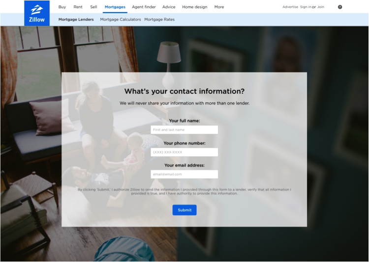
The business side wanted to increase conversions of our lender connection product, which asks the user 16 questions about their financial situation in order to connect them with a local lender. Unsurprisingly, the page that asked for the user’s name and contact information had the highest drop off in the funnel.
I had a hypothesis about why this was the case:
There were three questions this slide vs. one question on all other slides, which was inconsistent and added to the users’ cognitive load
This is where we ask for her most personal information
We don’t set expectations about what will happen next
Existing version of the contact page
The Solution
I proposed splitting the questions into three slides. I had pushback from the team, because in an earlier iteration of the product, one page contact form won in an A/B test. But I won them over by pointing out:
Putting each question on one slide follows the pattern she has seen on 15 previous slides
After she’s already given us one piece of sensitive information, she’s already committed and will therefore be more willing to take one more step
Asking for her email address before phone number allows us to remarket if she drops off on the final page
Other ways I improved the experience:
I made the language more human and friendly to match our “trusted advisor” brand voice guidelines and help this overwhelming process seem less overwhelming
On the last slide, I made it clear what was going to happen next
results
This small change made a huge impact:
+30% increase in conversions
+$6M in annual revenue


